Images
This section covers adding images to your website. Swarthmore webpages are set up to allow editors to quickly and easily add an image at the top of any webpage. This location is called the Primary Image and is the most common method for adding images to a webpage.
Editors can also choose to add an image within the body copy of a page. This option involves a few more steps, but it allows editors to place images anywhere within the body content.
Images can also be added through many of the available components. This is covered in the Components section.
Website homepages also provide additional layout options, including the ability to display two images or a large full-span image.
Alt text is a written description of an image. It is displayed when an image cannot be loaded and is essential for visitors using assistive technologies such as screen readers, those browsing with images disabled, or those with limited bandwidth.
The WCAG Alt Decision Tree is a useful resource for deciding whether an image requires alt text and what that description should include. Think about how the image relates to the surrounding content. If it adds meaning or improves understanding, it should include meaningful alt text.
Writing effective alt text is a skill. One helpful approach is to imagine describing the image to someone over the phone so they understand both what it shows and why it is included. For additional guidance and examples, see Alt Text as Poetry.
6.1 Adding a Primary Image
1. The Primary Image field is located below the Title and Subtitle fields and above the Body field. This is where editors add an image that appears at the top of the webpage.
2. Click the Insert an Image button. A window titled Insert an Image will appear.

3. In the Insert an Image window, select Upload Image to upload a new image or Select Image to choose an image that has already been uploaded to the site's image library.
4. Select the appropriate image using the radio button to its left.
5. Click the Select Image button in the lower-left corner.

6. A thumbnail preview will now appear. Whenever you add an image to a webpage, you must include alternative text.
7. Under Image Alignment, choose one of the following options:
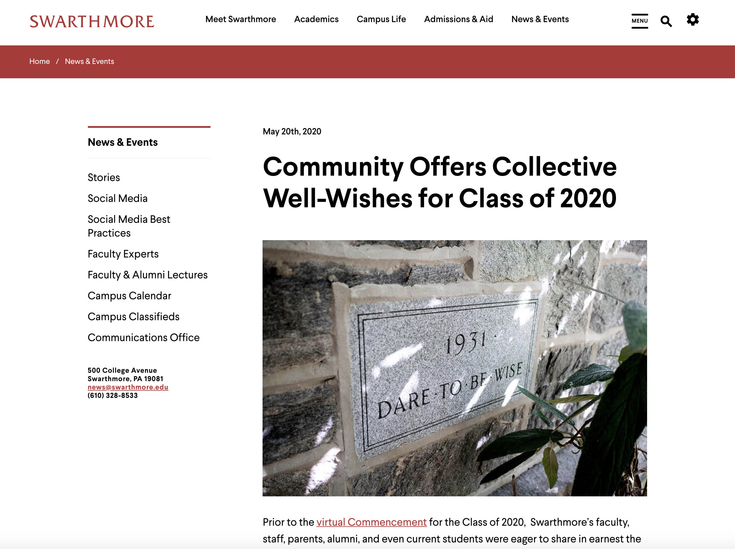
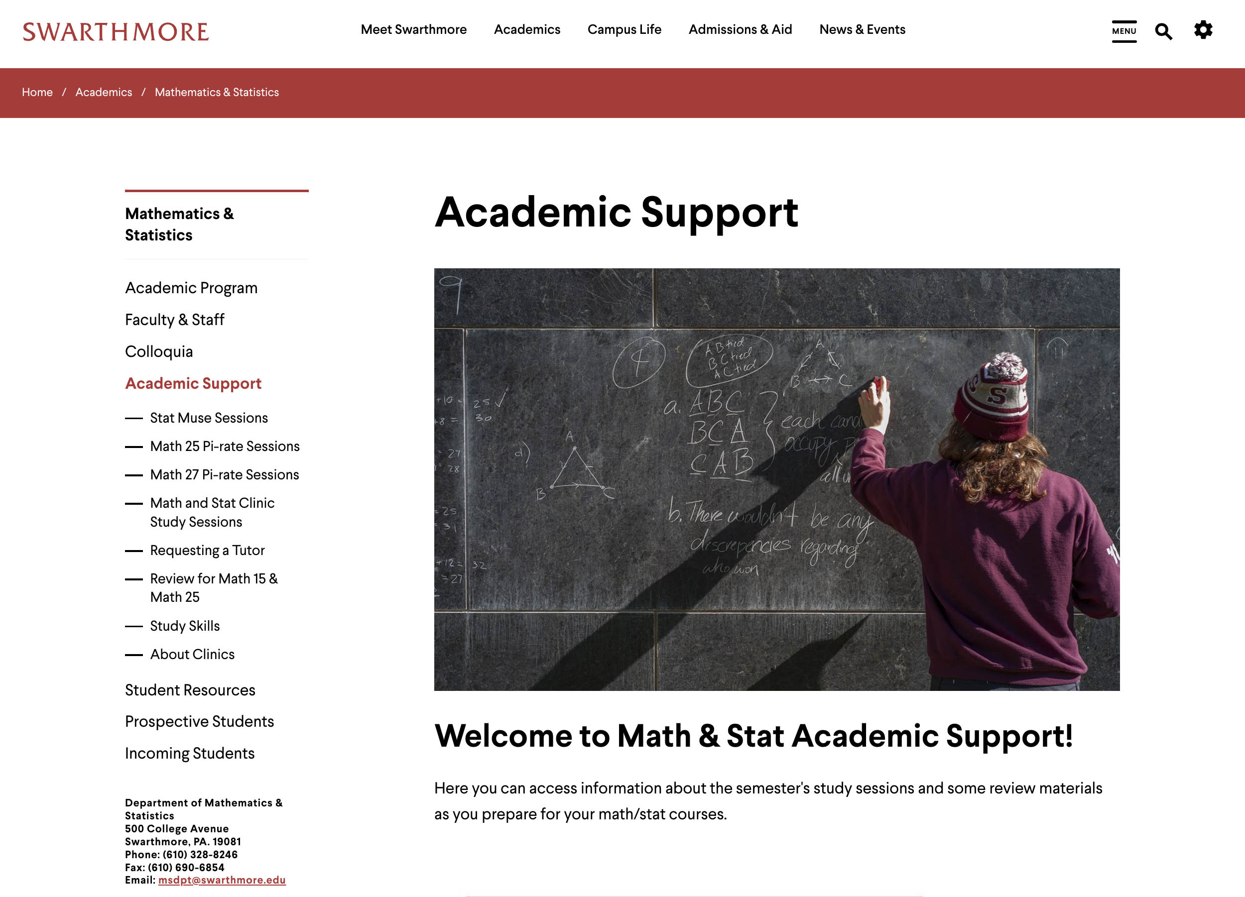
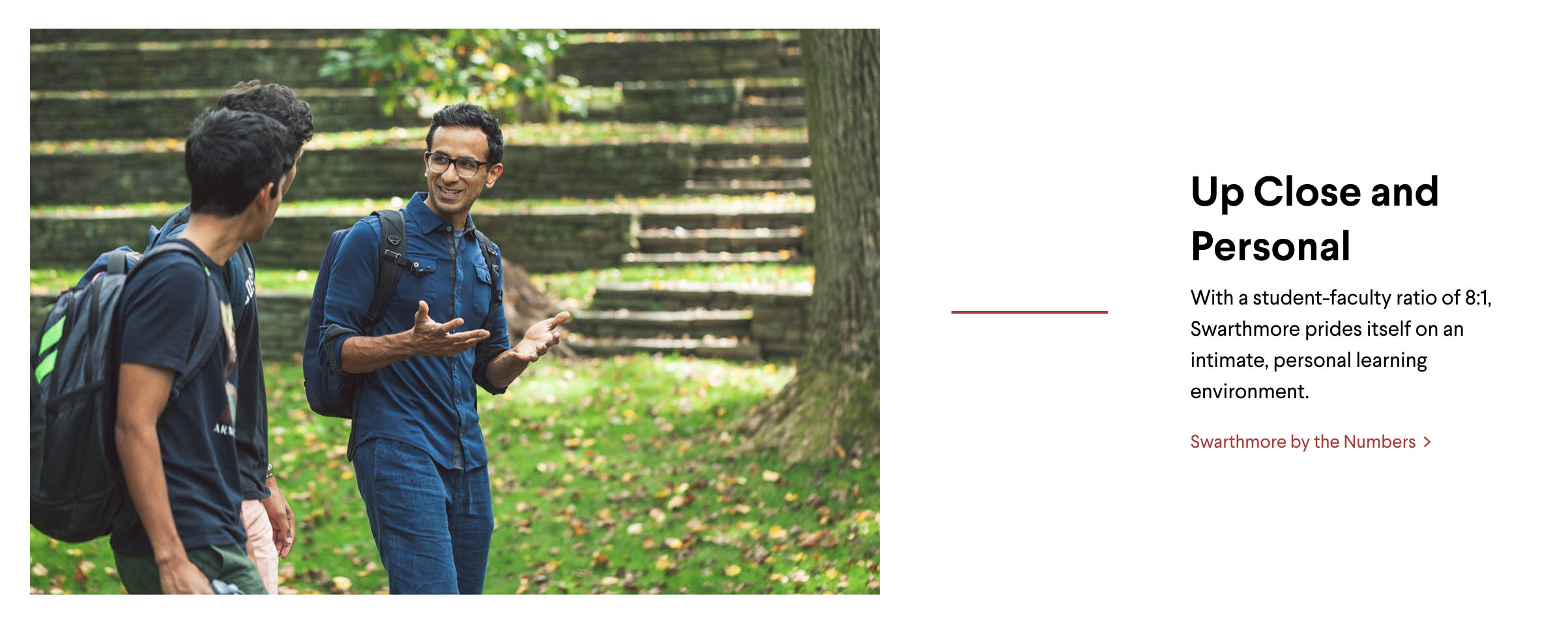
- Centered Above Content — Best for large landscape images. The image is displayed above the body content.
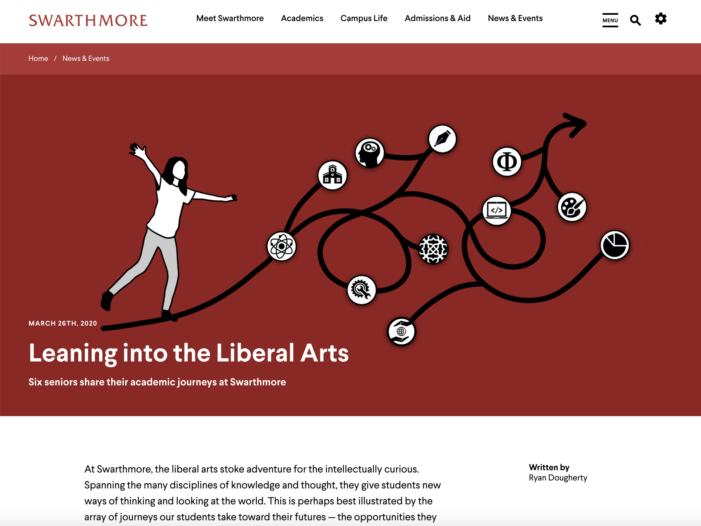
- Floating Right — Best for portrait or smaller images. The image is displayed to the right of the body content and the text wraps around it. If a large landscape image is used, Drupal automatically scales it down before wrapping the text.
Centered Above Content

Floating Right

8. Optionally, add an image caption to provide additional context for readers.

6.2 Adding an Image in the Body Copy
You can also choose to add images directly within the body copy rather than using the primary image at the top of the page. This process involves a few additional steps, but allows you to position images closer to the content they reference.
1. Place your cursor where you want the image to appear.
2. Click the Add Image using Image Browser button.

3. In the Insert an Image window, choose Upload Image to upload a new image or Select Image to use an image that has already been uploaded to the website.
4. Select the desired image using the radio button.
5. Click the Select Image button in the lower-left corner.

6. The image will now appear in the body copy.
7. Use the image toolbar to manage the image's properties.

The Insert Image in Body Copy toolbar provides several options:

- Manage Alt Text / Decorative Image — Allows you to add alternative text or mark the image as decorative. All meaningful images require alt text to meet Swarthmore's accessibility standards. Decorative images should only be used when an image conveys no additional information beyond the surrounding content.


- Toggle Caption On/Off — Shows or hides the image caption field.

- Image Link — Allows you to make the image a link. See Links for more information.

- Standard Image Alignment / Caption Styles — Controls image alignment and caption placement.
- Caption Below — The image remains full width and centered. The caption appears beneath the image.
- Caption Right — The image remains full width and floats left. The caption appears to the right.
- Image Floated Left Caption Below — The image is reduced to approximately 50% width and floated left. The caption appears below, and body text wraps around both.
- Image Floated Right Caption Below — The image is reduced to approximately 50% width and floated right. The caption appears below, and body text wraps around both.

- Gray Image Background Captions — Applies a gray background behind the image and caption.
- Gray Image Background / Image Centered — The image remains full width and centered. The caption appears below.
- Gray Image Background / Image Floated Left Caption Below — The image is reduced to approximately 50% width and floated left. The caption appears below, and body text wraps around both.
- Gray Image Background / Image Floated Right Caption Below — The image is reduced to approximately 50% width and floated right. The caption appears below, and body text wraps around both.

- Clear Styles — Removes any applied caption or alignment styles and returns the image to its default centered display with no caption.

6.3 Homepage Images
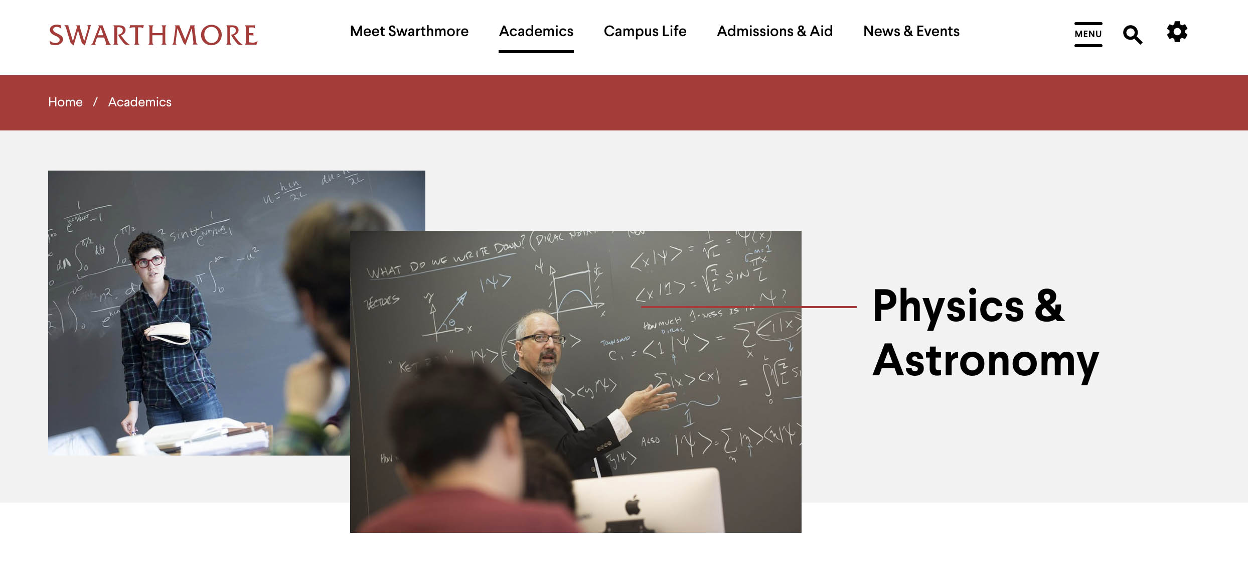
The homepage is unique in that it offers additional header image layout options. These include:
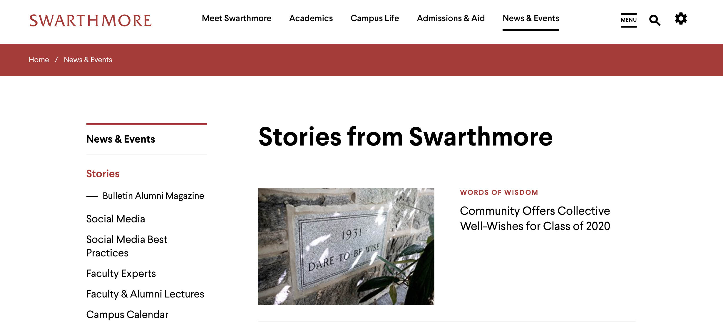
- One or Two Images Aligned Left — Display either one image or two stacked images to the left of the website title.
- One or Two Images Aligned Right — Display either one image or two stacked images to the right of the website title.
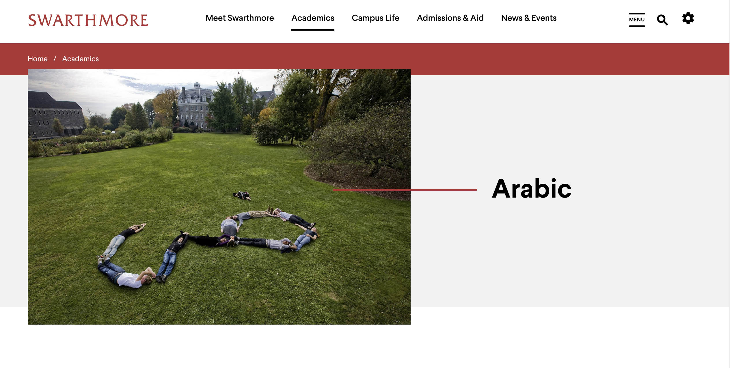
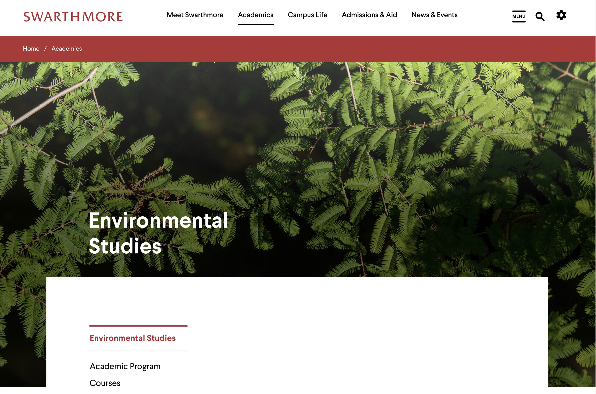
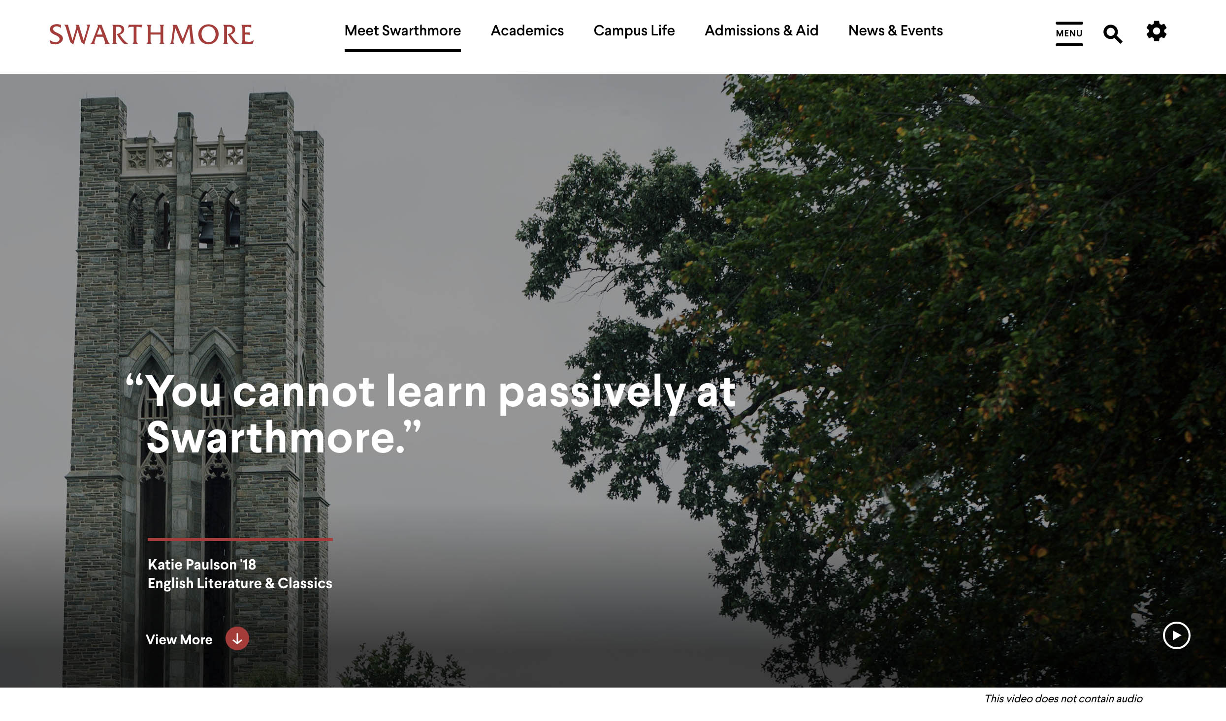
- Full-Span Image — Display a single image that spans the full width of the page. The page title is overlaid on the lower-left corner of the image.
Examples:
One Image Aligned Left

Two Images Aligned Right

Full-Span Image

The homepage header layout is managed by editing the homepage.
- Select the desired header layout from the dropdown menu.
- Optionally enable the overlay toggle to apply a subtle opaque filter to the Full-Span Image. This improves the readability of the page title displayed over the image.
- Add a new image (or a second image, depending on the selected layout).
- View the current image and alt text. You can also replace or remove the image.
- Save the homepage as either Draft or Published.
- Click Save to commit your changes or Cancel to discard them.

6.4 Recommended Image Sizes
The following image style guide shows the recommended image dimensions for pages, components, profiles, news, and events.
6.4.1 Recommended Sizes for Header Images
| Image Type | Retina (WxH) | Standard (WxH) | Preferred Ratio | Preferred Orientation |
|---|---|---|---|---|
| Homepage - Single Image | 1756 x 1170 | 878 x 585 | 3:2, 16:9 | landscape |
| Homepage - Double Image (Front) | 1056 x 704 | 528 x 352 | 3:2, 16:9 | landscape |
| Homepage - Double Image (Rear) | 880 x 662 | 440 x 331 | 3:2, 16:9 | landscape |
| Homepage - Full Width | 3500 x 1360 | 1750 x 680 | custom | landscape |
| Standard Page | 1524 x 940 | 762 x 470 | 3:2, 16:9 | landscape |
6.4.2 Recommended Sizes for Components
| Image Type | Retina (WxH) | Standard (WxH) | Preferred Ratio | Preferred Orientation |
|---|---|---|---|---|
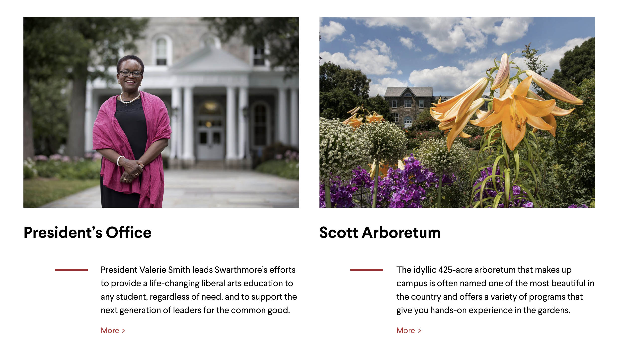
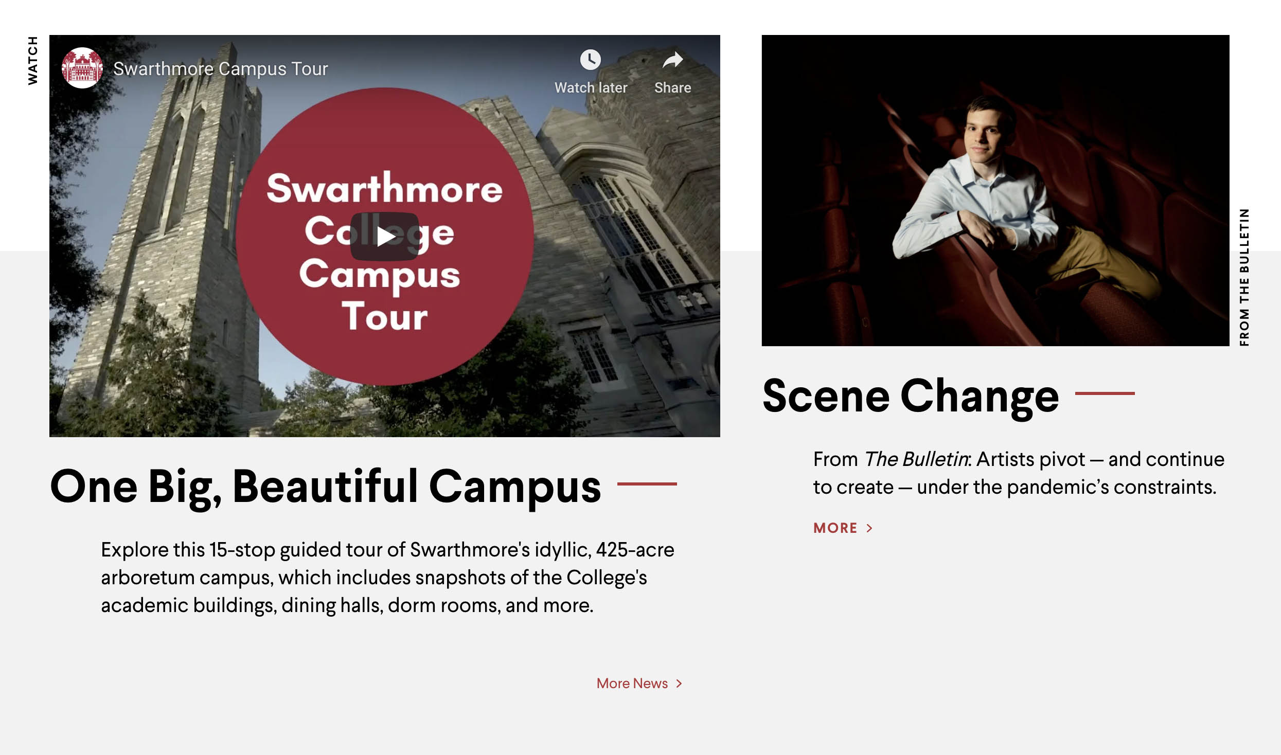
| Feature | 1530 x 1046 | 765 x 523 | landscape | |
| Feature Link List | 1300 x 858 | 650 x 429 | landscape | |
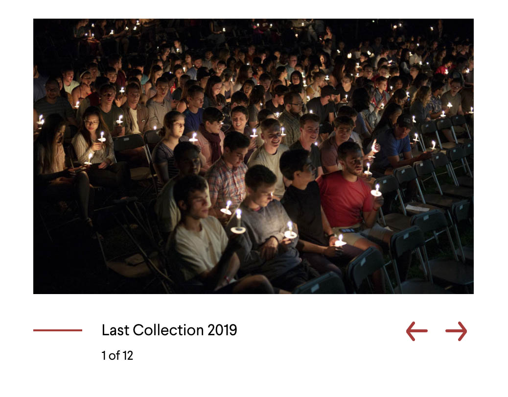
| Image Slider (Slideshow) | 1600 x 1000 | 800 x 500 | 8:5 | landscape |
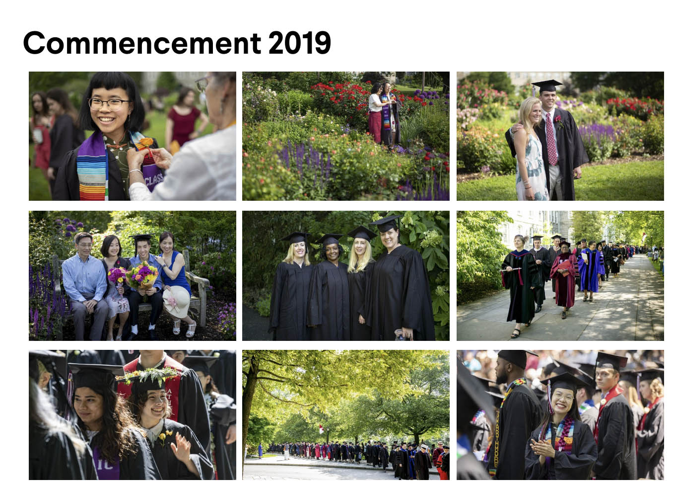
| Image Slider (Gallery Thumbnails) | 720 x 476 | 360 x 238 | 16:9 | landscape |
| Media Object List | 960 x 600 | 480 x 300 | 8:5 | landscape |
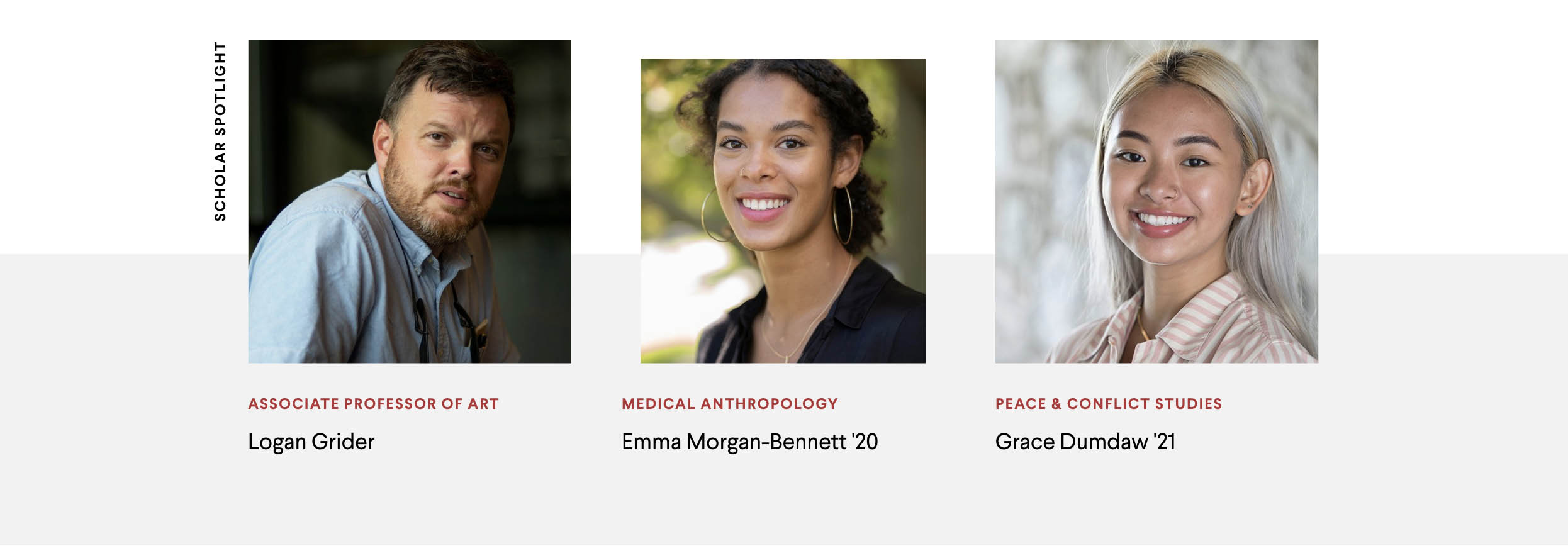
| Multi-Column Callout | 600 x 600 | 300 x 300 | 1:1 | landscape |
| Image Callout | 1560 x 1040 | 780 x 520 | landscape | |
| Full Width Callout | 3500 x 1240 | 1750 x 620 | custom | landscape |
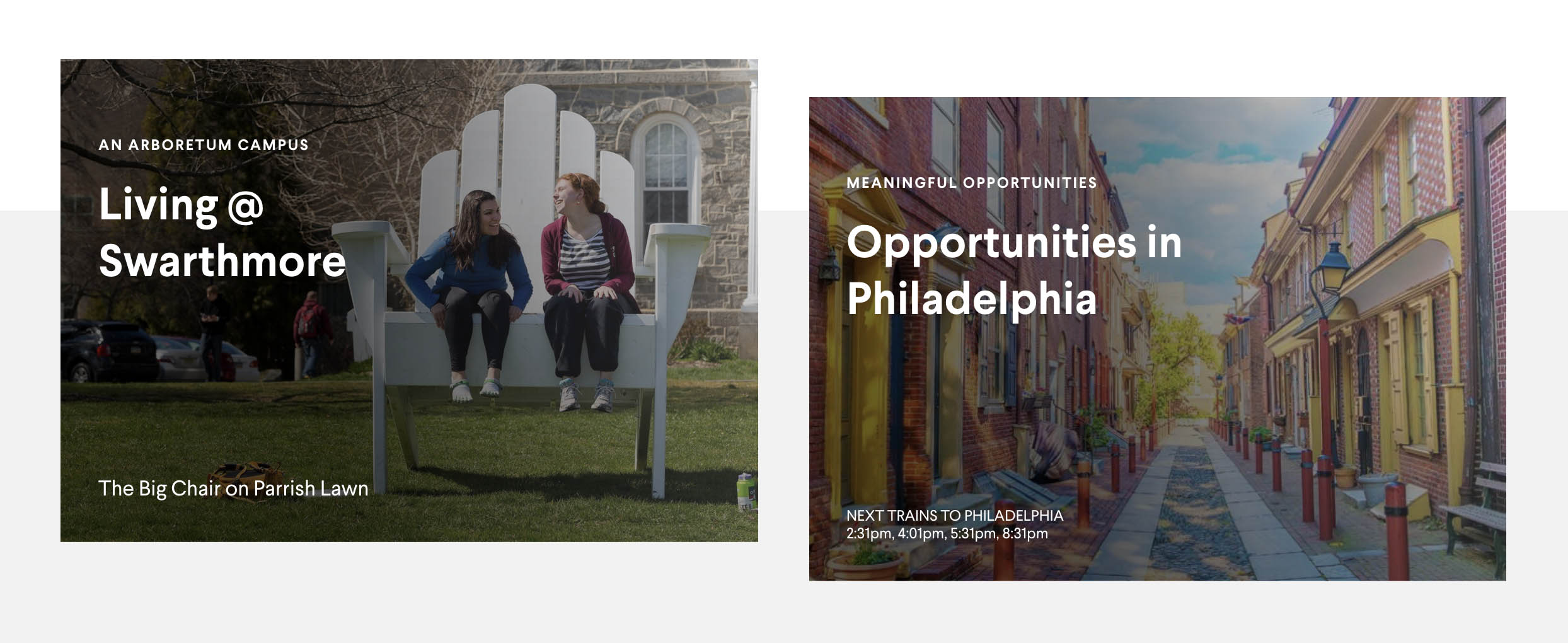
| Callout on Image | 1300 x 900 | 650 x 450 | 3:2, 16:9 | landscape |
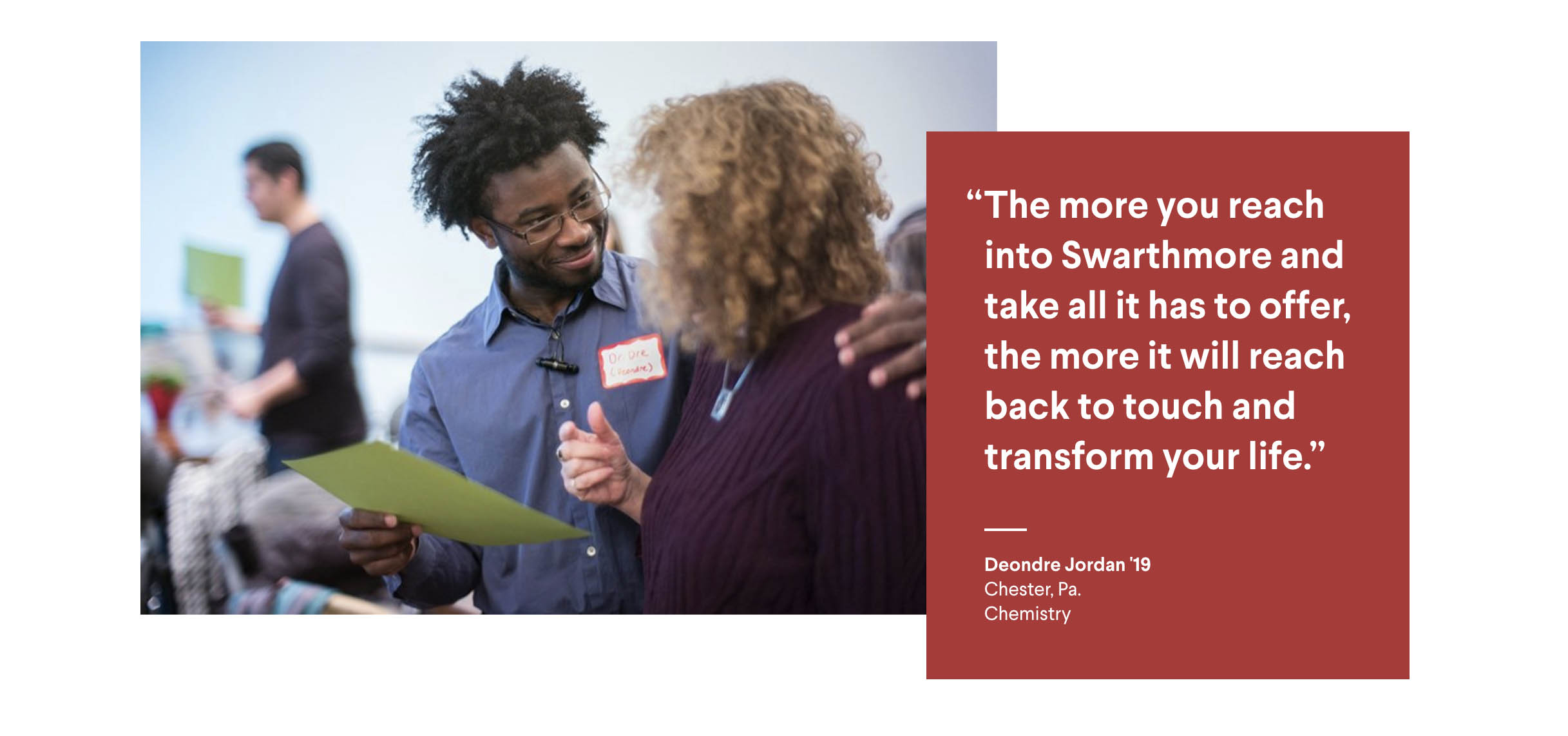
| Feature Story Callout (Left) | 1530 x 1046 | 765 x 523 | 3:2 | landscape |
| Feature Story Callout (Right) | 1070 x 698 | 535 x 349 | 3:2 | landscape |
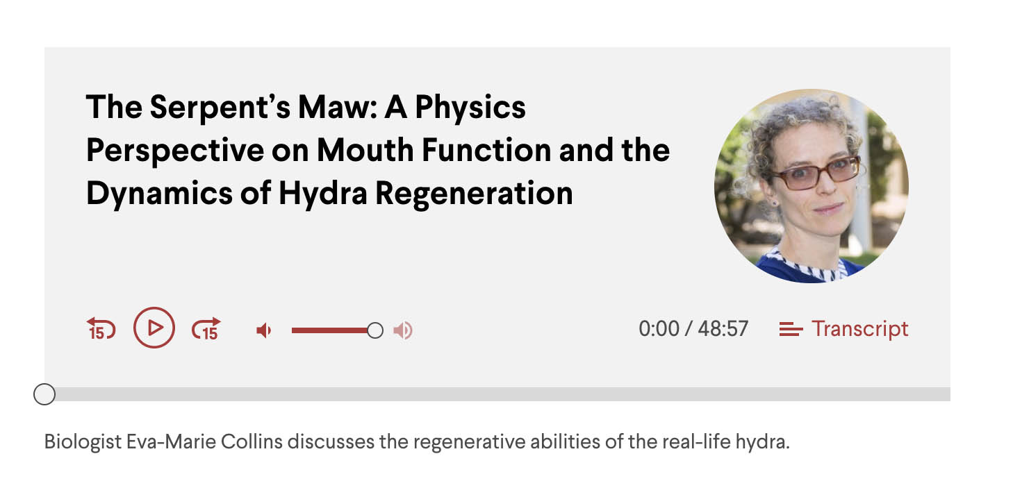
| Audio (Thumbnail) | 298 x 298 | 149 x 149 | 1:1 | square |
| Ambient Video (Fallback Image) | 3500 x 1464 | 1750 x 732 | custom | landscape |

6.4.3 Recommended Sizes for Profiles
| Image Type | Retina (WxH) | Standard (WxH) | Preferred Ratio | Preferred Orientation |
|---|---|---|---|---|
| Profile Headshot | 372 x 466 | 186 x 233 | 4:5 | portrait |

6.4.4 Recommended Sizes for News and Events Pages & Thumbnails
| Image Type | Retina (WxH) | Standard (WxH) | Preferred Ratio | Preferred Orientation |
|---|---|---|---|---|
| News Page (Standard) | - | - | - | - |
| News Page (Featured) | 2880 x 1266 | 1440 x 633 | 16:9, 3:2 | landscape |
| News Feed Pane (Standard Thumbnail) | 560 x 320 | 280 x 160 | 16:9, 3:2 | landscape |
| News Feed Pane (Featured Thumbnail) | 1760 x 960 | 880 x 480 | 16:9, 3:2 | landscape |
| News Feed Pane (Full Page Listing) | 840 x 480 | 420 x 240 | 16:9, 3:2 | landscape |
| Events Feed Pane (Thumbnail) | 840 x 532 | 420 x 335 | 16:9, 3:2 | landscape |
| Events Feed Pane (Full Page Listing) | 840 x 670 | 420 x 335 | 16:9, 3:1 | landscape |